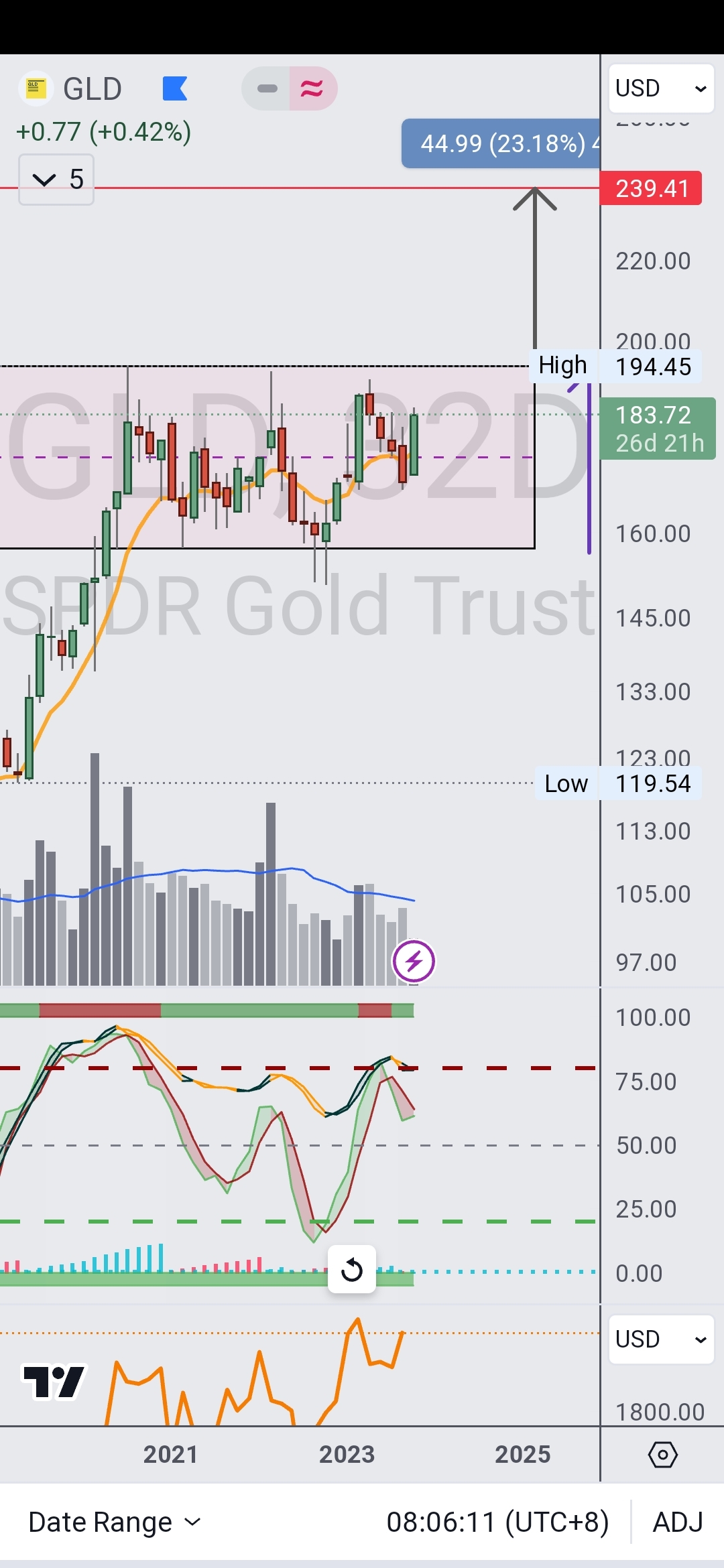
Goldie, goldie...You still playing tricks with us?...or this time is for real.
Using GLD as proxie on a 32D chart, we can see the consolidation range and how the highs were not broken, yet the low range was...wyckoff spring. Declining volume while price consolidates being another sign of accumulation.
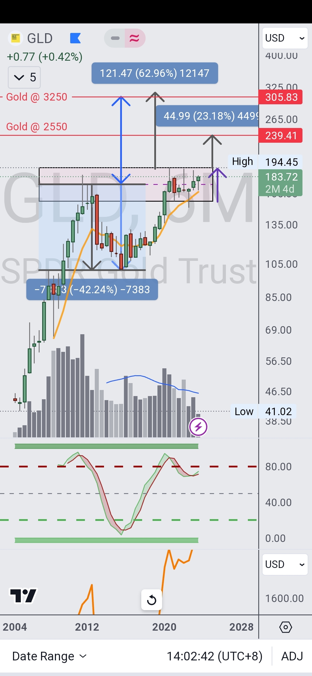
6 months chart...more insights. Volume pattern is just textbook...can see current range interacting with 2009-11 top range (distribution)
More on future posts (for the points), and let's cherry pick dates a bit...last 23 years...putting crypto aside...can guess what is the best performing asset? (Spx, nasdaq or gold)?


Disclaimer: Investing carries risk. This is not financial advice. The above content should not be regarded as an offer, recommendation, or solicitation on acquiring or disposing of any financial products, any associated discussions, comments, or posts by author or other users should not be considered as such either. It is solely for general information purpose only, which does not consider your own investment objectives, financial situations or needs. TTM assumes no responsibility or warranty for the accuracy and completeness of the information, investors should do their own research and may seek professional advice before investing.
Comments