The Resilient US economy is Charging Up the Fed!
“Reducing inflation is likely to require a sustained period of below-trend growth, and there will very likely be some softening of labor market conditions. Restoring price stability is essential to set the stage for achieving maximum employment and stable prices over the longer run. We will keep at it until we are confident the job is done.”- Jerome Powell, September 21st, 2022
The Federal Reserve Chair Jerome Powell reiterated that the Fed has the “means and resolve” to restore price stability. As I mentioned a fortnight ago in my newsletter: “Checkmate”, Powell has taken the “Volcker Avatar” and will relentlessly pursue his goal of bringing down inflation to the long-term target of 2%. But unfortunately, in the process, there will be “deeper” pain than anticipated.
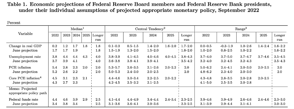
Summary Of Economic Projections (SEP), released four times a year, summarises the FOMC participants’ projections for GDP growth, unemployment rate, inflation, and the appropriate policy interest rates.
One can reasonably assume that the SEP, along with the dot plot, provides an idea of what the most influential Central Bank in the world thinks about the trajectory of the US economy and the future path of monetary policy.
Today, we will discuss the SEP data and look at some interesting data points to see how strong the US economy is.
Summary Of Economic Projections (SEP)!
The SEP affirms the worst fears about the US economy. We are currently in stagflation, and if the projections are accurate, then the next two years will also be a period of stagflation.
The real GDP growth is projected to be just 0.2% for 2022 and 1.2% for 2023, indicating that the tighter monetary policy will eventually lead to a slowdown (already visible).
The most intriguing part of the projections is the unemployment rate. The labor market is so hot that the Fed foresees the unemployment rate to peak at 4.4% in 2024, even after setting the terminal rate at a whopping 4.6%. As Powell explained:
“The labor market continues to be out of balance, with demand for workers substantially exceeding the supply of available workers.”
This confirms the inherent strength of the US economy and labor market. Let us understand the nuances of the tight labor market with some numbers.
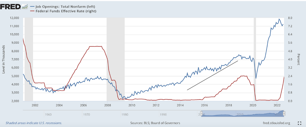
This chart shows the FFR (Fed Funds Rate) and the Job Openings (Non-Farm). We can conclude that the labor market started to become tight in 2015–2016 due to a strong economy, and as a result, the Fed commenced to tighten the monetary policy.
However, as we all know, Fed shut its eyes last year and was way behind the curve when the labor market became incredibly tight and inflation began to rise.
The Job Openings remain overly elevated, and as a result, the labor market continues to remain “out of balance”. This has resulted in lower unemployment numbers even after the Fed tightens at the fastest rate since the 80s.
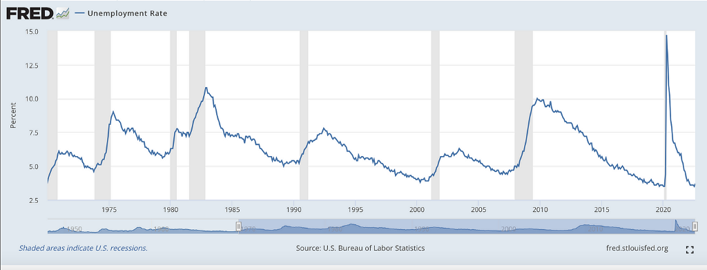
This is a slightly longer-term chart. I present this chart to highlight the relation between the recessionary period (grey areas in the chart) and the unemployment rate. As we can see, mild recessions have led to unemployment rising to around 6–7%, and a very deep recession like the GFC saw the unemployment rate shoot to 10%.
However, if we go with the SEP, the current recession will lead to an unemployment rate of less than 4.5%, which is quite unusual. This indicates that the US economy is resilient and the labor market is robust. Furthermore, the Fed expects a soft landing for the economy.
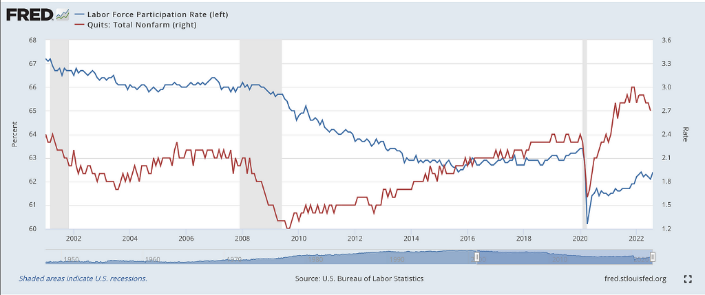
The tight labor market can also be attributed to the high quit rates due to the rise of the side hustle culture and the lower labor force participation rates, which have still not recovered to the pre-pandemic levels.
The quit rate after the pandemic reached historical highs and reached 3%. The rates remain elevated, with the latest reading coming at 2.7% in July. On the other hand, the labor force participation rate has started to inch up but still has a long way to go (100 bps) before it reaches 2020 levels.
However, the long-term trend is lower for the labor force participation rate, as visible post the GFC.
Housing and Manufacturing!
Housing is the real economy as it is a significant driver of economic growth. Post-pandemic, we saw a swift recovery in the housing sector in the US, which had seen a modest recovery in the last twelve years post the great housing crash.
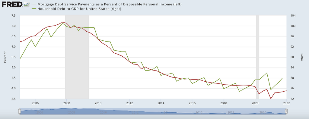
The most significant difference between today and 2008 is that the average household has been able to deleverage extensively. Thus, the housing sector in the US has significantly lower leverage than the GFC and is in a much better position to face the headwinds arising from rising mortgage rates.
We can observe that Household Debt to GDP has fallen significantly from the GFC highs of more than 100% to 80% today, indicating “substantial” deleveraging among the households.
Furthermore, Mortgage Debt Service Payment as % of Disposable Personal Income has fallen from 7% to less than 4%, majorly due to lower interest rates while the wages rose. However, this number could increase as the mortgage rates have hit their highest since 2008.
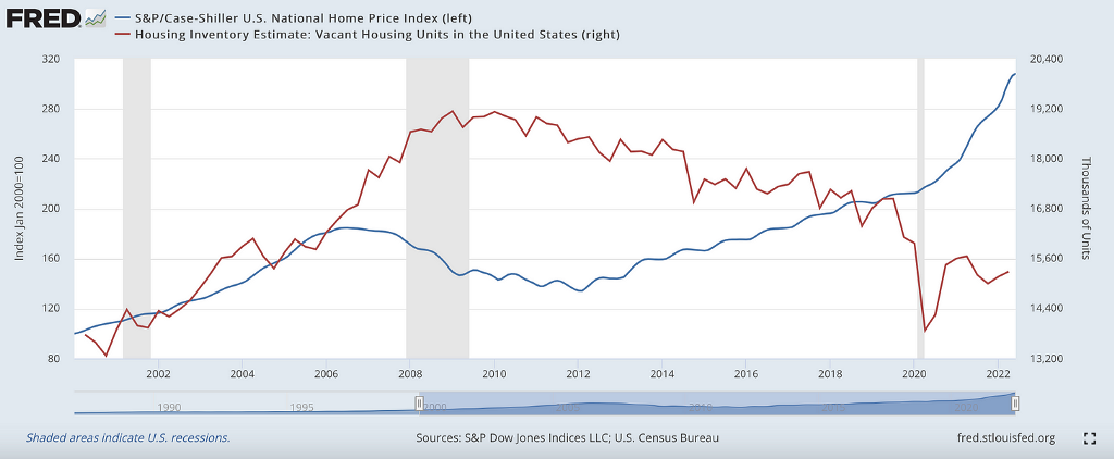
If we talk about home prices, the data demonstrates that home prices have significantly rallied post-covid. S&P/ Case-Shiller Index tracks the housing prices throughout the US. The index moved from 215 in Feb 2020 to 308 in June, an increase of more than 40% in just 2.5 years!
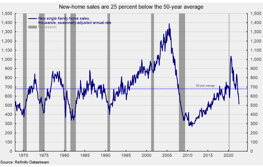
However, far lower than in 2008, the vacant housing units prove that the housing market is tighter in terms of supply than the GFC. In addition, single-family home sales have fallen significantly due to the rising mortgage rates as it becomes dearer to own a home (lower affordability).
Since housing is the leading indicator, the data indicates that the economy is clearly cooling off. Powell confirmed the same in his statement:
“Activity in the housing sector has weakened significantly, in large part reflecting higher mortgage rates. Higher interest rates and slower output growth also appear to be weighing on business fixed investment, while weaker economic growth abroad is restraining exports.”
However, a comparison similar to 2008 is unwarranted as the households, and the housing market are in much better shape than the GFC. We will surely see a price correction, but a “crash” is out of the question.
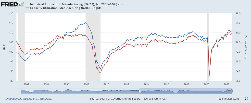
The manufacturing sector is holding out rather well.
As we can see, capacity utilization is at historical highs, and industrial production is at a fourteen-year high. Though a lot of manufacturing has moved out of the US in the last decade, the current energy crisis in Europe can be a game-changer.
When the sentiment is weak, and the whole world is talking about the doom and gloom scenario due to a super hawkish Fed, the businesses deter from investing in new manufacturing capacity as the upcoming recession will lead to slowing consumption. As a result, we are witnessing a slowdown in the business fixed investment.
High Yield (HY) Defaults!
In 2008, the canary in the coal mine was the subprime loans which led to the meltdown in the financial sector and led to a string of defaults across the spectrum. The financial sector today is in a much better position.
Some market participants argue that the canary in the coal mine today is the leveraged loan market.
We can see that the HY default rate remains at historical lows even after the HY has now reached 8.65%. Even the leveraged loan markets have seen fewer defaults than the HY bond market.
As the rates rise above 10%, most probably by January as the Fed hikes twice, the HY defaults will surely increase going forward; however, with the economy too strong, it is expected that they may remain below the 2008 or 2020 peaks.
Conclusion!
On all parameters, the US economy seems resilient even after the harshest hikes in interest rates in decades. The labor market has been remarkably strong; however, we must remember that unemployment is a lagging indicator, and the consequence of rate hikes will be known in the coming months.
Housing, the leading indicator, indicates that the economy is witnessing a slowdown. Furthermore, prices have started to fall in various cities. Nevertheless, as discussed, a crash is an unlikely scenario, and a price correction of 10–15% will be the “maximum” pain the housing sector will witness.
Though the Fed expects a soft landing with its SEP projections, it will be intriguing to see what happens with the unemployment numbers. My base case scenario is that the unemployment rate will rise to 5%+ by H12023.
Lastly, just a reminder that Fed today is super hawkish, but the scenario can completely reverse in no time.
More To Go! was originally published in DataDrivenInvestor on Medium, where people are continuing the conversation by highlighting and responding to this story.


Comments