The Technology Option Report
Summary
- Up to 50% or more of a stock’s price, either up or down, can be driven by the emotions of fear and greed alone.
- The "puts to calls" ratio measures these emotions and is useful at signalling market trends.
- Our “puts to calls” ratio compares the amount of money going into “puts” versus “calls,” not the number of contracts purchased. It's called the premium "puts to calls" ratio.
- The technology sector, as well as technology ETF XLK, are showing extremely low "puts to calls" ratios, suggesting caution for investors.

Peach_iStock/iStock via Getty Images
This is both an educational article and a forecasting report. It explains how current option activity in the technology sector shows an historically high risk area and should be avoided and/or partially sold.
The Importance of Investor Sentiment and Price Expectations
Up to 50% or more of a stock’s price, either up or down, can be driven by the emotions of fear and greed alone. So, the Sentiment King doesn’t look at the economic picture; instead, we directly measure what investors expect a stock, or the market, to do.
A universal warning sign is when “too many” investors expect the same thing. When “too many” investors expect a stock to go up, it generally goes down - and vice versa. This simple truth has been mentioned by every great investor over the last 100 years. The key is having a metric that measures when “too many” investors are expecting something. This is what the Sentiment King looks for. The “puts to calls” ratio is just such metric.
The Puts to Calls Ratio
Martin Zweig invented the “puts to calls” ratio in a Barron’s article in late 1971. Since “calls” are essentially bets that prices will rise, and “puts” bets they will decline, comparing "puts" to "calls" provides insight into what investors expect prices to do.
Contracts versus Money
The original “puts to calls” ratio was a ratio of the number of option contracts purchased; how many “put” contracts bought versus how many “call” contracts. It didn't consider the value of those contracts.
For many years comparing the value of the contracts wasn't possible, but now it is. So, at the Sentiment King, our “puts to calls” ratio compares the amount of money going into “puts” versus “calls,” not the number of contracts purchased. It's called the premium "puts to calls" ratio.
This is an important distinction.
Apple Stock as a Sample
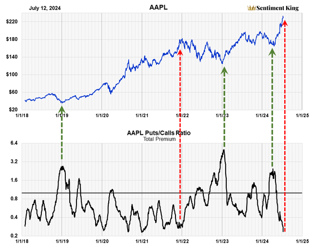
The Premium Puts to Calls Ratio of Apple (The Sentiment King)
As an example, the above chart is the premium “puts to calls” ratio for Apple (AAPL) stock. The ratio goes between .25 to 5.0. The black line represents 1.0, which is when equal amounts go into both puts and calls.
When the ratio is high, it means “too many” investors expect prices to decline, and when it's low, it means “too many” investors expect prices to rise. We've indicated a few of these moments with red and green arrows. Notice that prices generally go opposite the expectation, when expectations reach an extreme.
The Sentiment King Ranking Scale
The ratio that represents “too many” investors is determined from history and is different for each stock. The Sentiment King developed a Red-Green ranking scale that puts all stocks on the same scale. This allows for comparisons of one stock to the next, or one sector to the next.
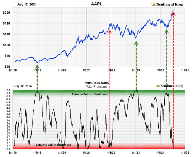
The Premium Puts to Calls Ratio Plotted on the Sentiment King Ranking Scale (The Sentiment King)
This chart is the same apple chart as before but with the “puts to calls” ratio graphed on the red-green ranking scale. The scale goes from -10 at the top to +10 at the bottom. Points between -9 and -10 are 5% of the highest ratios. Points between -9 and -8 are the next 5%. At the bottom, points between +9 and + 10 are the lowest 5% of ratios.
The Green Zone, which goes from -8 to -10, signals extreme levels of bearish sentiment. The Red Zone, which goes from +8 to + 10, signals extreme levels of bullish sentiment. In between these zones is a large grey area we call the neutral zone, where investor expectations are not at extreme levels.
We've inserted the same arrows as before, and you can see where they correspond on this new scale. This scale clearly shows extreme readings and also allows us to compare one stock to another, or one sector to another.
Option Activity as Long-Term Indicators
One criticism of using option activity is that option purchases can often be short term, as short as even hours. But this can be overcome by using long-term moving averages of the data, which takes out short-term fluctuations and presents a long-term perspective. Our ratio uses 20-day moving averages of put and call premiums, which is why our ratios show longer-term expectations. These ratios do not forecast short-term price movements, as you can see.
Sector Analysis
As we said, using option premiums allows us to combine the option activity of many stocks; using contracts doesn't. This allows us for the first time to compare what option ratios are saying for each sector.
This table puts all 13 S&P market sectors on the same ranking scale. The sector names are listed in the black row at the top.
The ranking of each sector is marked by an X in an orange colored cell. It essentially shows that the technology sector (far right) is approaching a Red Zone reading. Most of the other sectors are still well within the neutral zone and do not yet show extremes in investor expectations.
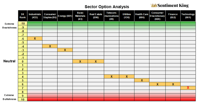
The Puts to Calls Ranking of the 13 Market Sectors (The Sentiment King)
The number in parenthesis after the sector name is the number of stocks that go into the calculation. For example, option activity in 661 technology stocks make up the technology “puts to calls” ratio.
Option Activity in the Technology Sector
This chart is the same as the apple chart, except it’s the “puts to calls” ratio of all 660 technology stocks plotted against the XLK - the State Street Technology ETF. Notice the ratio entered the red zone a week or two ago, and it's now sitting on the very edge of it. This is why it's located where it is in the sector table in the previous section.
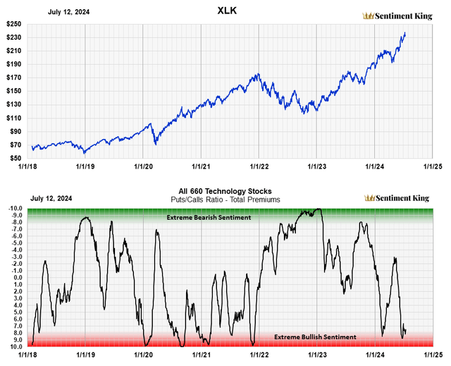
The "Puts to Calls" Ranking of 660 Technology Stocks Plotted Against the XLK Technology ETF. (The Sentiment King)
This metric of investor expectations shows we have “too many” investors expecting higher prices in technology stocks. It's saying that investors should be cautious about further investments in this sector, as the likelihood of lower prices is currently greater than higher prices.
The XLK 'Puts to Calls' Ratio
It would be strange if investors were buying “put” contracts in technology stocks but not “put” contracts in technology ETFs that invest in technology stocks. Remember, you can buy puts and calls in ETF's as well as individual stocks. Calculating “puts to calls” ratios of ETFs helps confirm “puts to calls” ratios of the stocks they are buying.
The chart below is the ranking of “put” and “call” activity in XLK itself. The current ratio for the ETF is well within the Red Zone, and there are simply “too many” bullish investors in XLK. The important point to note is how closely investor activity in the ETF and the technology stocks it buys correlate. Both are signaling the same thing - caution due to “too many” bullish investors.
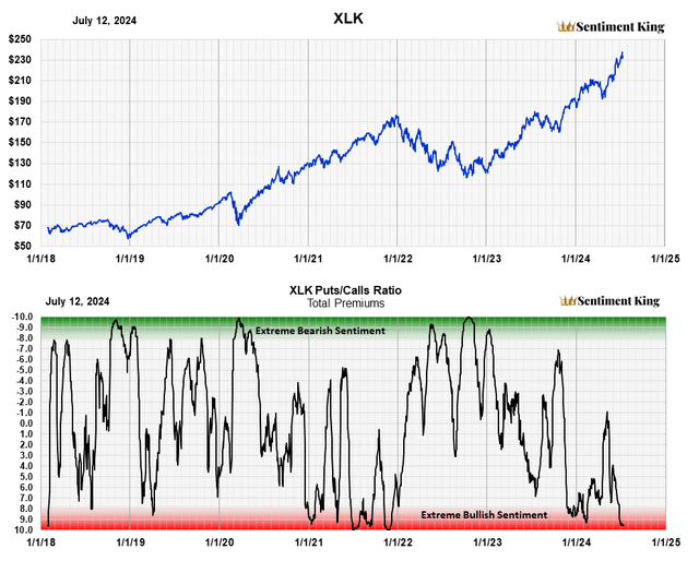
The "Puts to Calls" Ratio Of XLK Itself (The Sentiment King)
Conclusion
The "puts to calls" ratio of 660 technology stocks, as well as the "puts to calls" ratio of XLK, the second largest technology ETF, point to caution in the technology sector. Investors should not buy or add to positions. Those already invested should reduce their exposure by going to cash or into cash or bonds.
Disclaimer: Investing carries risk. This is not financial advice. The above content should not be regarded as an offer, recommendation, or solicitation on acquiring or disposing of any financial products, any associated discussions, comments, or posts by author or other users should not be considered as such either. It is solely for general information purpose only, which does not consider your own investment objectives, financial situations or needs. TTM assumes no responsibility or warranty for the accuracy and completeness of the information, investors should do their own research and may seek professional advice before investing.

